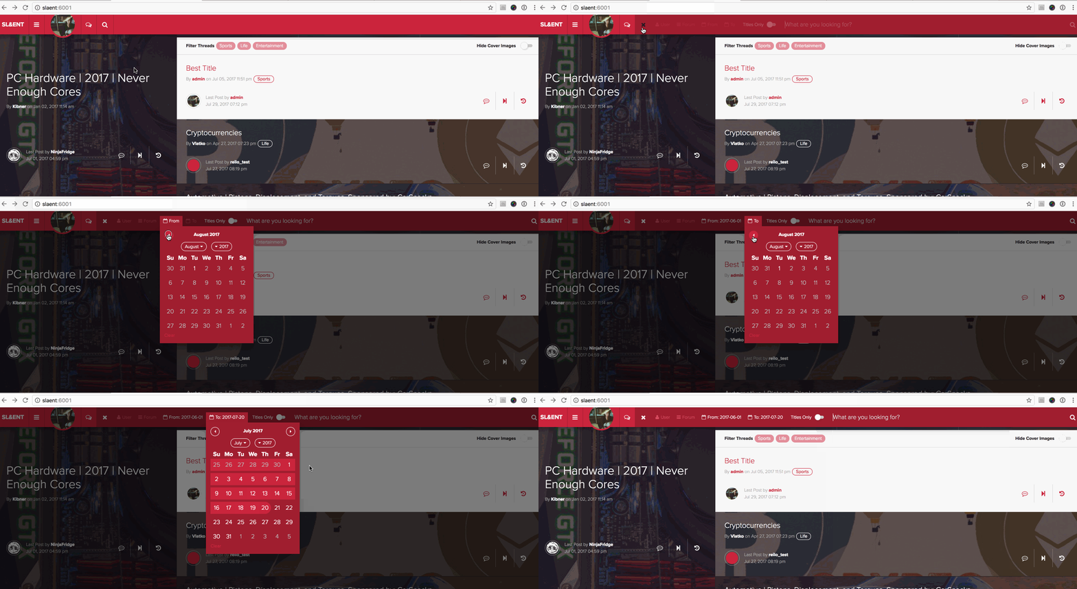
It's really impressive that this forum has been able to cope with suge a huge increase in traffic. You've done a great job reilo and Sharp.

Ah yes I forgot to suggest something that is absolutely crucial for the ones who are starved with mobile data.
Different image settings (Hide images/covers) for Desktop/Mobile versions.
I want to hide images on Mobile but keep the on Desktop for example. Does it make sense?
Different image settings (Hide images/covers) for Desktop/Mobile versions.
I want to hide images on Mobile but keep the on Desktop for example. Does it make sense?

One question, I am trying to upload a cover image but it's not saving. It's for the Latino Crew thread
https://slaent.com/thread/1255581/
https://slaent.com/thread/1255581/

By recon_zero Go To PostOne question, I am trying to upload a cover image but it's not saving. It's for the Latino Crew threadIs it jpeg?
https://slaent.com/thread/1255581/
1280x720

By recon_zero Go To PostI'm an idiot*facepalm*
Was supposed to click submit

By reilo Go To PostHrmm, my gut instinct? No. For all of its many great things about relational databases and specifically Postgres, calling COUNT for 25-50 separate threads to determine the post count is extremely slow. I can envision a future where we cache that metadata and grab it in some way with a slight statistical lag, but until we determine an appropriately performant way to do, it'll be left out for bigger fish to fry.Thanks for the explanation, I have absolutely zero idea how those sorts of things worked from a programming perspective - it was just something I was "used to" on GAF / other forums and kinda missed here, since it makes it easy to see popular threads and whether there have been many new posts since you last posted in a thread. I'll get used to it though, and completely understand there's more important features that are higher priority.

Can we get png usage for pictures instead of jpg? Maybe it is something simple I am missing but the old avatar request thread on GAF I had for my avatars they would do PNG only and I stil have those but can't set as my avatar. Great site by the way. Whoever did this site needs a pat on the back and a wad of cash. One of the most modern feeling forums I have been on in years.

Really nice forums. There are a few features that I would really like to see:
1. a down arrow at the top of a page to immediately jump to the bottom of the page, which is especially helpful on mobile
2. an link at the top of the first post of a thread to go back to the subforum in which the thread was posted
3. a count of the replies and views for each thread in the thread list
4. a user option to change (increase) the number of posts per page

By m_shortpants Go To PostI like the navigation buttons at the bottom of a thread/page, but would it be possible to add a link to go back to the forum you were at right there?
Something like this
Quoting to see any other takers for this?

The 'bug' with WhoQuotedMe that i mentioned seems to be fixed, thanks dude(s).
I'd put it all in tabs on the profil-----user edit (*_*) page. [ Account | Ignore List | WhoQuotedMe | Subscriptions* | Etc ]
(Like what you doing with the search :thumbsup:)
By reilo Go To PostI'll probably move the Who Quoted Me to a separate page or tab or something once I have time, but this will do!
I'd put it all in tabs on the profil-----user edit (*_*) page. [ Account | Ignore List | WhoQuotedMe | Subscriptions* | Etc ]
(Like what you doing with the search :thumbsup:)

@reilo, @sharp
Really impressed with you guys' level of foresight when it comes to the structural design and optimization of this site. It was evident on the first day of being here. It's honestly one of the reasons that convinced me to stay here (that, and the chill community). If I could donate something to support you guys, I most certainly would. Speaking of, if there's somewhere we can send donations, please let me know. It might not be much, but I'd try to throw something your way every now and again.
Really impressed with you guys' level of foresight when it comes to the structural design and optimization of this site. It was evident on the first day of being here. It's honestly one of the reasons that convinced me to stay here (that, and the chill community). If I could donate something to support you guys, I most certainly would. Speaking of, if there's somewhere we can send donations, please let me know. It might not be much, but I'd try to throw something your way every now and again.

By brainchild Go To Post@reilo, @sharpNot at this time thank you.
Really impressed with you guys' level of foresight when it comes to the structural design and optimization of this site. It was evident on the first day of being here. It's honestly one of the reasons that convinced me to stay here (that, and the chill community). If I could donate something to support you guys, I most certainly would. Speaking of, if there's somewhere we can send donations, please let me know. It might not be much, but I'd try to throw something your way every now and again.
people offering donations speaks volume to the work Reilo Sharp and kibner have done. And they deserve all the praise they get.
As the community grows we will reassess how this forum is funded and will explore all options.

By Kabro Go To PostNot at this time thank you.
people offering donations speaks volume to the work Reilo Sharp and kibner have done. And they deserve all the praise they get.
As the community grows we will reassess how this forum is funded and will explore all options.
Alright. Well, please keep us posted for any changes to this in the future!

By reilo Go To Posti feel like I saw this gif 2 years ago
Soon™
Getting it to this point was a lot of work and even moreso on the backend. The re-done search results page will take some work, too.
and
uh
keep up the good work
and kibner too!

By Madness Go To PostCan we get png usage for pictures instead of jpg? Maybe it is something simple I am missing but the old avatar request thread on GAF I had for my avatars they would do PNG only and I stil have those but can't set as my avatar. Great site by the way. Whoever did this site needs a pat on the back and a wad of cash. One of the most modern feeling forums I have been on in years.An easy way to convert them is to open it up in MS Paint (or other image editor) and just "save as..." .jpg.

Also, it's too soon to be giving me any credit. I was only brought on the last week or so and my first change hasn't quite made it in. But when it does, lazy posters will rejoice for there will be keyboard shortcuts in the editor for several BBCode functions as well as "submit post".

By Kibner Go To PostAlso, it's too soon to be giving me any credit. I was only brought on the last week or so and my first change hasn't quite made it in. But when it does, lazy posters will rejoice for there will be keyboard shortcuts in the editor for several BBCode functions as well as "submit post".that was the best thing about the old editor. Nice to hear that it might make a return.

By Angelus Errare Go To PostRust eh, you're good people.You never notice his avatar before? lol Sharp is legit like that and was about Rust for a long long while.

By Madness Go To PostCan we get png usage for pictures instead of jpg? Maybe it is something simple I am missing but the old avatar request thread on GAF I had for my avatars they would do PNG only and I stil have those but can't set as my avatar. Great site by the way. Whoever did this site needs a pat on the back and a wad of cash. One of the most modern feeling forums I have been on in years.No because it’s impossible to scale those down to a reasonable file size. Every avatar you upload is cropped and resized to save bandwidth and improve load times. We might have .webp support in the future but I know nothing about where that standard is at.

By s y Go To PostAm I going crazy or when did we only have 3 categories/sections?For more than a year now, I think.

By s y Go To PostAm I going crazy or when did we only have 3 categories/sections?Wow

By s y Go To Postthat was the best thing about the old editor. Nice to hear that it might make a return.Low-effort/shit-posting excepted, I am all about spending the least amount of effort to post.

By s y Go To PostAm I going crazy or when did we only have 3 categories/sections?smdh

By s y Go To PostAm I going crazy or when did we only have 3 categories/sections?

By Arkanius Go To PostAh yes I forgot to suggest something that is absolutely crucial for the ones who are starved with mobile data.Yes we can make this happen but it might be per device.
Different image settings (Hide images/covers) for Desktop/Mobile versions.
I want to hide images on Mobile but keep the on Desktop for example. Does it make sense?
By Brandson Go To PostReally nice forums. There are a few features that I would really like to see:Noted.
1. a down arrow at the top of a page to immediately jump to the bottom of the page, which is especially helpful on mobile
2. an link at the top of the first post of a thread to go back to the subforum in which the thread was posted
3. a count of the replies and views for each thread in the thread list
4. a user option to change (increase) the number of posts per page

By kreven Go To Post@reilo: GAF-migrant here, love what you’ve done with SL&ENT.This has been driving me crazy and I never understood why but I think I know why it does it now and it’s so easy to fix: the bidy background is purple by default so Chrome bases the scroll at color off of that *facepalm*
I’m not sure how many if these were discussed in the past, bit here’s some feedback from my part:
- On iOS (Safari, iPhone) the scroll bar in the white/default theme is impossible to see as it seems to be themed (white on white). You can only really see it when you’re at the top or bottom of the page (white on red). You don’t get a feel for the length of the page because of this. No issue with the Dark theme however (white on black).
Will fix.

By reilo Go To PostNo because it’s impossible to scale those down to a reasonable file size. Every avatar you upload is cropped and resized to save bandwidth and improve load times. We might have .webp support in the future but I know nothing about where that standard is at.
What about webm (embedded in a post)? That'd be dope.

Just have to say I never liked dark theme on anything but yo I just switched and this dark theme is crazy good!

So a fair number of recent posts which have quoted me aren't appearing in the new page.
It is showing a few posts from back in December 2015 though...
It is showing a few posts from back in December 2015 though...

By TheMikado Go To PostJust have to say I never liked dark theme on anything but yo I just switched and this dark theme is crazy good!
Same. I usually don't like dark themes, but this one is on point. I think it works so well due to the sleekness of the site design in general, and the base and accented colors complement each other well.

By jem Go To PostSo a fair number of recent posts which have quoted me aren't appearing in the new page.Yeah, it's a bit glitchy but it's to be expected I guess. A few didn't kick in until today for me.
It is showing a few posts from back in December 2015 though…

By s y Go To PostYeah, it's a bit glitchy but it's to be expected I guess. A few didn't kick in until today for me.Hopefully it's just for posts prior to the page being added.

The misinformation here about Samsung Android is pretty sad. They used to be bad but actually quite good now. And this is someone who was an avid Nexus user, the Galaxy S8 is top knotch.

By TI92 Go To PostThe misinformation here about Samsung Android is pretty sad. They used to be bad but actually quite good now. And this is someone who was an avid Nexus user, the Galaxy S8 is top knotch.Ive heard that their Android skin has slimmed down quite a bit from their infamous touchwiz days. I dont know of that effects web dev much tho.

By s y Go To PostIve heard that their Android skin has slimmed down quite a bit from their infamous touchwiz days. I dont know of that effects web dev much tho.
They have one of the best Android enhancements now imo

By jem Go To PostSo a fair number of recent posts which have quoted me aren't appearing in the new page.I released an updated query in the middle of the night, let me know if it’s still an issue.
It is showing a few posts from back in December 2015 though…
Also, if a user quotes another post with the quote button after you, that will count as the quoted post.

Also, reilo you may know this already but the code tag is actually broken on mobile. I made an issue about it and quite a few other users noted it as well. Not sure a solution off the top of my head since I haven't seen your code yet

If you held a gun to my head and said "suggest something, noob".....
I'm looking at the landing page using the light theme. The thread links with white backgrounds mixed with the ones which have cover images is jarring. There is more visual separation between those thread links than there is between the whole list and the rest of the landing page.
If, on the landing page specifically, the imageless thread links had a dark filter over the background like the ones with cover images do, it would be easier to look at and maybe less confusing. Also, there's not a great middle ground for screen brightness there, between being able to read one and not getting blinded by the other.
Love the site.

By TI92 Go To PostAlso, reilo you may know this already but the code tag is actually broken on mobile. I made an issue about it and quite a few other users noted it as well. Not sure a solution off the top of my head since I haven't seen your code yetNoted it, will take a look tonight.

By Megatherium Go To PostIf you held a gun to my head and said "suggest something, noob"…..Noted!
I'm looking at the landing page using the light theme. The thread links with white backgrounds mixed with the ones which have cover images is jarring. There is more visual separation between those thread links than there is between the whole list and the rest of the landing page.
If, on the landing page specifically, the imageless thread links had a dark filter over the background like the ones with cover images do, it would be easier to look at and maybe less confusing. Also, there's not a great middle ground for screen brightness there, between being able to read one and not getting blinded by the other.
Love the site.

Rounded avatars forever. Don't think I can ever go back to square avatars. Only suggestion I have is that I wish I could subscribe to threads, but this is already in the works if I remember correctly.

Not sure if this has been brought up, but general thoughts on this yellow block? I don't know that there's much of a reason for it to exist.
https://imgur.com/VBbyAnm
It's taking a way a lot of screen space for no apparent reason, and there doesn't seem to necessarily be any rhyme or reason to the threads that are listed in this area.
https://imgur.com/VBbyAnm
It's taking a way a lot of screen space for no apparent reason, and there doesn't seem to necessarily be any rhyme or reason to the threads that are listed in this area.

By TI92 Go To PostThe misinformation here about Samsung Android is pretty sad. They used to be bad but actually quite good now. And this is someone who was an avid Nexus user, the Galaxy S8 is top knotch.
It's still not pure Android though. The beauty of stock Android is that you can have it as basic or as feature complete as you want, but at least you have a choice.

I’ll probably up the number of promoted threadson the homepage now that we have more traffic which will help with that. It basically scales to the height of the content on the right. I also tweaked the “welcome to SLAENT” on the homepage to be shorter buttons which should clean that up as well.

Probably mentioned already, but a faster way to refresh a page would be immensely appreciated.
Never used it on GAF but the dark theme here is beautiful.
By brainchild Go To PostSame. I usually don't like dark themes, but this one is on point. I think it works so well due to the sleekness of the site design in general, and the base and accented colors complement each other well.
Never used it on GAF but the dark theme here is beautiful.


