
By psychintellectProxy site or .net address pls. Site is blocked at work. Temp forum still accessible though.
So the Salent bar is on the left now? When I want to make replies, I actually can (posting from work now).
I'm quoting this because the video game page is blocked at work. Nothing to be addressed. Just pointing it out.
I guess some computers have older versions of IE. Sometimes I can login, sometimes I can't. I'll keep you updated.

By Zero ToleranceBy psychintellectProxy site or .net address pls. Site is blocked at work. Temp forum still accessible though.
So the Salent bar is on the left now? When I want to make replies, I actually can (posting from work now).
I'm quoting this because the video game page is blocked at work. Nothing to be addressed. Just pointing it out.
I guess some computers have older versions of IE. Sometimes I can login, sometimes I can't. I'll keep you updated.
Looks like your work filter is quite granular. It probably keyword searches the page before it delivers it to you and if it reads certain key words then it will block it for you. Shitty.

Like the new back/forward page buttons
Don't like there's no "reply" button at the bottom of each page now
Don't like there's no "reply" button at the bottom of each page now

By pilonv1Like the new back/forward page buttons
Don't like there's no "reply" button at the bottom of each page now
There hasn't been one in over a month :P

New homepage UI is up and running.
One cool thing... The background where the Forums reside is generated by the most recent post owner's avatar.
One cool thing... The background where the Forums reside is generated by the most recent post owner's avatar.

By reiloNew homepage UI is up and running.Eh, I get what you are going for but it was a lot more usable when it was one list. Looking at it now, I have no idea which thread I have or haven't read without comparing the time stamps between the four forums and the welcome thread is taking 4 of the 12 spots.
One cool thing… The background where the Forums reside is generated by the most recent post owner's avatar.

I think it'll make more sense once the other forums start getting more active. It's also why I limited it to 3 threads per forum for it to be just a quick recap of what is happening. I imagine most people still go directly to a forum to browse.
And as always, this will be tweaked over time, if not outright redone lol.
And as always, this will be tweaked over time, if not outright redone lol.

Front page loads like shit on mobile compared to the previous layout.
Latest chrome on android by the way. Using a LG G3.
Latest chrome on android by the way. Using a LG G3.

By psychintellectFront page loads like shit on mobile compared to the previous layout.
Latest chrome on android by the way. Using a LG G3.
Can you take a screenshot? Thanks.

By reiloIt loads but It takes a lot longer than it did before so a screen probably wouldn't really help with anything. And its not as responsive. I'm speaking just about the front page.By psychintellectFront page loads like shit on mobile compared to the previous layout.
Latest chrome on android by the way. Using a LG G3.
Can you take a screenshot? Thanks.

Re-did the homepage... again.
This should fix your performance issues, too, Psy.
I got myself a new Wacom tablet, which means I have everything I need to start working on a logo next.
This should fix your performance issues, too, Psy.
I got myself a new Wacom tablet, which means I have everything I need to start working on a logo next.

Nice. It did!
What wacom did you get? I have the intuos pro medium. Was rocking a bamboo for the longest.
What wacom did you get? I have the intuos pro medium. Was rocking a bamboo for the longest.

By psychintellectNice. It did!
What wacom did you get? I have the intuos pro medium. Was rocking a bamboo for the longest.
Just the Intuos Pen + Touch. Don't need anything fancy. I needed something compact to keep around in my backpack.

Yep, I'm really liking the new homepage. Not sure if the mobile one changed too but it looks good (I like it better than the desktop one actually). Keep it up!

I am currently working on an improved post editor, one that won't just lazily wrap your text in bbcode but outright render it properly as a true WYSIWYG editor would. This way you users should have an easier time formatting their posts to be legible to their style. Stay tuned.
On the mobile site right now and it looks pretty good.
Will a black theme of sorts be implemented? That's the only request I have.
Will a black theme of sorts be implemented? That's the only request I have.

By Storm ChamberOn the mobile site right now and it looks pretty good.
Will a black theme of sorts be implemented? That's the only request I have.
It's on the docket but I won't get to it for a while. There's more pressing issues to be sorted out.

By OmzzAny plans for "go to page __" option?Yea that can be added in.
Would be helpful in those NBA monthly threads

Would it be possible to make the typing cursor immediately jump back to the text body after you hit any of the text editing options up top?
It's a bit cumbersome to have to click the italics button then click inside the to enter your text.
It's a bit cumbersome to have to click the italics button then click inside the to enter your text.

By KingGondoWould it be possible to make the typing cursor immediately jump back to the text body after you hit any of the text editing options up top?
It's a bit cumbersome to have to click the italics button then click inside the to enter your text.
I'm working on a brand new WYSWYG editor that would eliminate that and BB Codes all together.

By reiloGood stuff, thanks.By KingGondoWould it be possible to make the typing cursor immediately jump back to the text body after you hit any of the text editing options up top?
It's a bit cumbersome to have to click the italics button then click inside the to enter your text.
I'm working on a brand new WYSWYG editor that would eliminate that and BB Codes all together.
Site is going great so far though.
Except for Forever making OKC bombing jokes.

By KingGondoWould it be possible to make the typing cursor immediately jump back to the text body after you hit any of the text editing options up top?
It's a bit cumbersome to have to click the italics button then click inside the to enter your text.
I agree this is annoying, but you can highlight the text/image and then hot the button. Easier work around for now.

I think I've nailed down how I want the UX to behave for how you create threads and replies. I think it will make a lot more sense in context and usability. Stay tuned.

So, for a while I had a goal in mind to eliminate the need to format your posts with BBCodes and go to a simpler user experience by utilizing a real WYSIWYG editor. So I made one, tailor made for this site's needs that will give the opportunity to expand it down the line (SoundCloud, YouTube, etc):
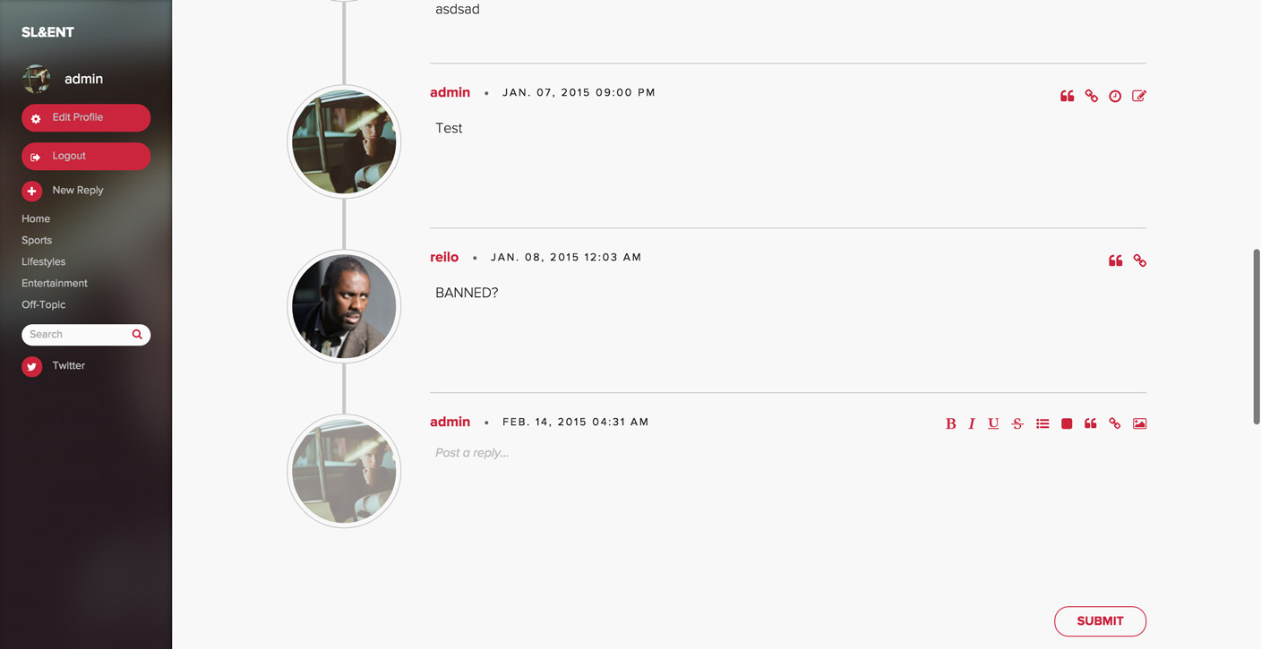
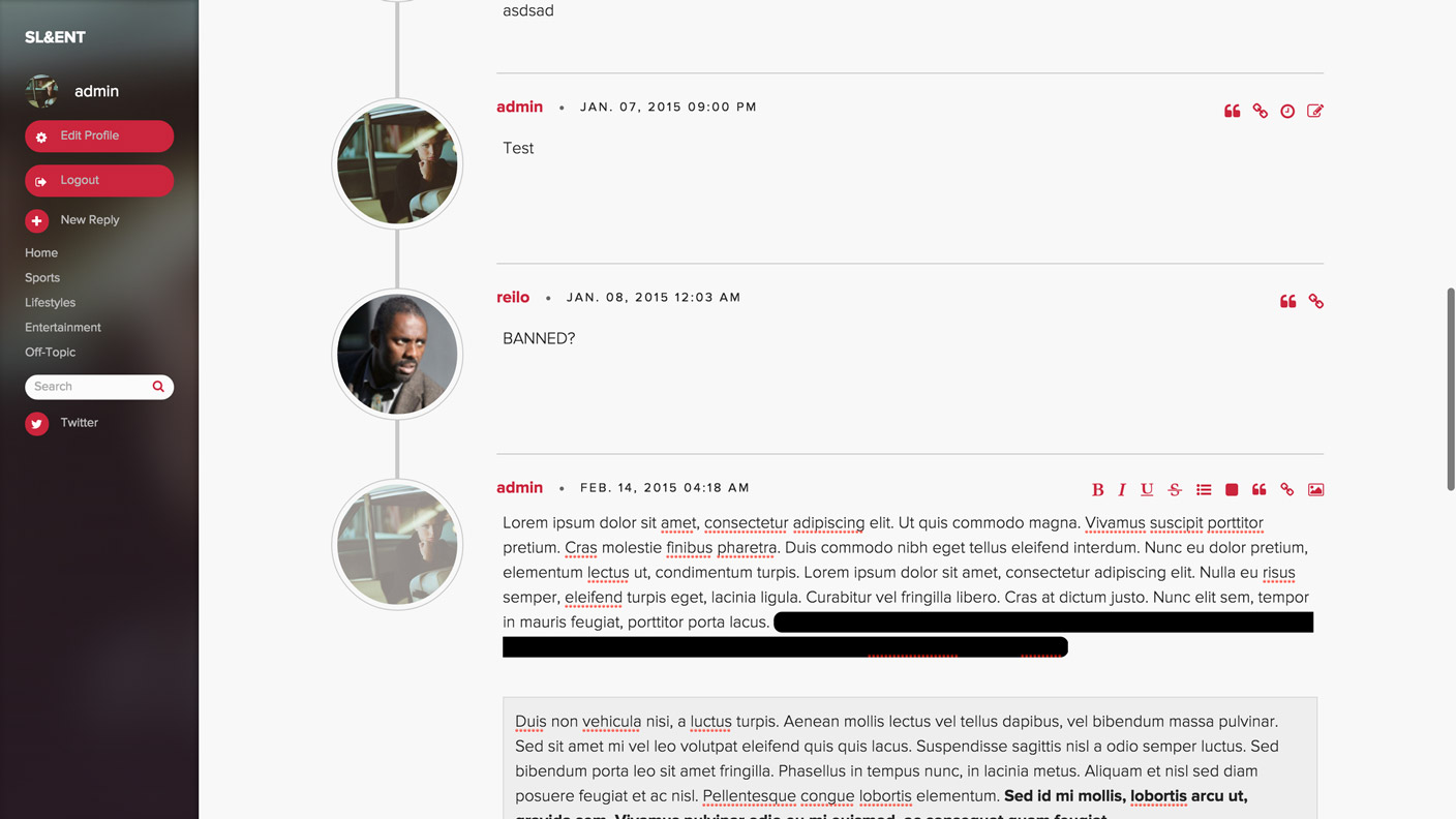
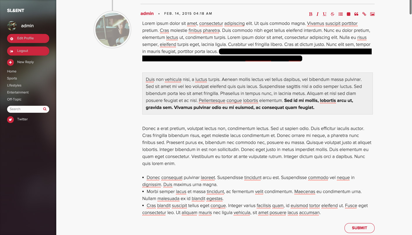
Note: I haven't fully bake out the UI for this, but basically in the future there won't be any awkward slide-out reply boxes and you'll know exactly what you post before you hit submit.
Oh, and I implemented a little check that will prevent double-posting from now on.


Note: I haven't fully bake out the UI for this, but basically in the future there won't be any awkward slide-out reply boxes and you'll know exactly what you post before you hit submit.
Oh, and I implemented a little check that will prevent double-posting from now on.

By hypernimaFavicon soon?As soon as I make that logo.
By J10This site runs sluggish on and crashes Safari on my iPhone4 and I don't know why.
That sucks. Although, your phone is like 5-6 years old. There comes a certain point where I have to make the hard decision and say, "I can't have support for everything, there's just not enough use case for it." iPhone 4 might be one of those now. I'm doing quite a bit of heavy CSS3 bits, including heavy gradients and whatnot.

By J10Understood.
Might there be an option to disable the display of images around here at some point?
There could be, but it would require another UI iteration, which probably won't be for a while.

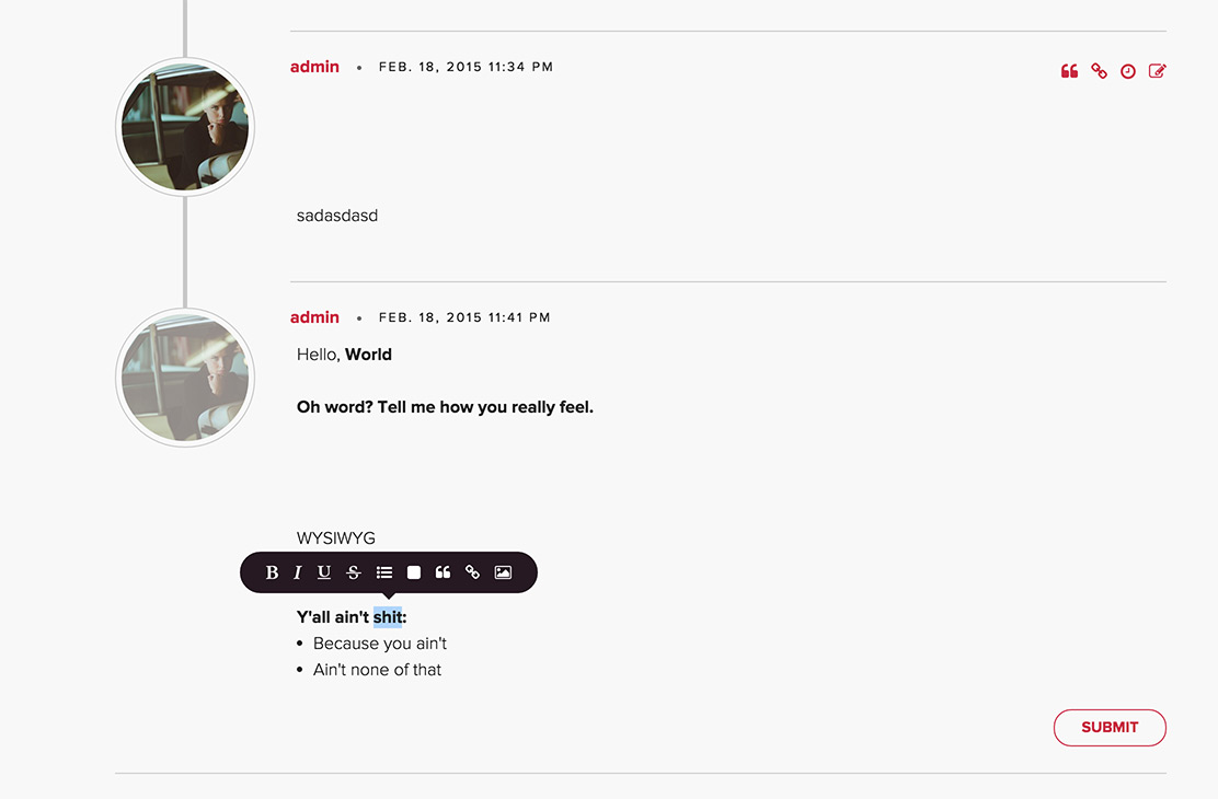
Still working out the details. The UX of how images, quotes, and lists are inserted needs to be solved, and I need to do a bunch of cross-browser testing.

First things first, love the design on the site. You've done a really good shop. Very slick.
Just a couple of things that I'd love to see though:
1. Easier navigation through the pages, let me input a page number or something.
2. An auto refresh feature, just leaving the page open in a tab without having to refresh is so incredibly convenient
Just a couple of things that I'd love to see though:
1. Easier navigation through the pages, let me input a page number or something.
2. An auto refresh feature, just leaving the page open in a tab without having to refresh is so incredibly convenient

By reiloRe-did the homepage… again.
This should fix your performance issues, too, Psy.
I got myself a new Wacom tablet, which means I have everything I need to start working on a logo next.
A very lightweight all caps Avant Garde with tight letterspacing and the special "A" with a right-leaning wedge slant would be slick IMO. There are some very sexy ampersands that'd work too to connect SL&ET.
Here are my suggestions from using on mobile (iOS)
• opt-in setting for images to avoid burning mobile bandwith unintentionally
• using the refresh button could hopefully send you directly to the position you were looking at when you pushed it (instead of your last post or top of page)
• there seems to be an issue with the text input area when quoting a large post. It starts your cursor at the bottom of the window rather than shoving the quoted text up off the screen)
Hope this doesn't sound too critical. Love the site so far.

My own personal logo was made from Avant Garde lol.
Nope, not critical at all. I wouldn't have made the thread and kept dialog going. User feedback is important, but I always caution that at the end of the day I reserve the last call on UX and UI decisions.
This version of the site has only been up since the end of the November, with a beta that works in the works for roughly 6 months. Everything is built from scratch, so it's not the most feature complete site just yet, but it will be to a reasonably degree in the future.

By reiloMy own personal logo was made from Avant Garde lol.
Nope, not critical at all. I wouldn't have made the thread and kept dialog going. User feedback is important, but I always caution that at the end of the day I reserve the last call on UX and UI decisions.
This version of the site has only been up since the end of the November, with a beta that works in the works for roughly 6 months. Everything is built from scratch, so it's not the most feature complete site just yet, but it will be to a reasonably degree in the future.
Wow this site is in great shape for being only alive 6 months. And yeah it's important to reserve final say on UI and UX.
I take it you are a fellow graphic designer then? The site has a really clean and cohesive design. Can definitely tell there was a keen eye for design present in the creation process.

I'm a front-end developer by trade, but I can do design, backend, and sysadmin stuff, although I try to stick to the more creative problem solving aspects like UX/UI, front-end/back-end. I only do sysadmin stuff on personal projects like these.
Sharp did all of the crazy database engineering and wrote the most-awesome and performant queries. I owe a lot to his technical expertise in helping making this site perform the way it does.
Sharp did all of the crazy database engineering and wrote the most-awesome and performant queries. I owe a lot to his technical expertise in helping making this site perform the way it does.

Any chance you guys could implement "go to last unread post" instead of going directly to the last post in the thread? I think that's the feature I'm missing the most.
Aside from that, it would be nice to have more options than "next page and previous page". Like having the first page, last page and in the middle a few (5?) pages with link. I just spent 2 hours going thru the football thread to reach the end
Aside from that, it would be nice to have more options than "next page and previous page". Like having the first page, last page and in the middle a few (5?) pages with link. I just spent 2 hours going thru the football thread to reach the end

By ElcheleAny chance you guys could implement "go to last unread post" instead of going directly to the last post in the thread? I think that's the feature I'm missing the most.
It's been discussed but there's a huge performance hurdle to overcome to do it right. Implementing "last unread post" is non-trivial and could see the performance of the site really suffer in consequence.
By ElcheleAside from that, it would be nice to have more options than "next page and previous page". Like having the first page, last page and in the middle a few (5?) pages with link. I just spent 2 hours going thru the football thread to reach the end
Noted.

By reiloBy ElcheleAny chance you guys could implement "go to last unread post" instead of going directly to the last post in the thread? I think that's the feature I'm missing the most.
It's been discussed but there's a huge performance hurdle to overcome to do it right. Implementing "last unread post" is non-trivial and could see the performance of the site really suffer in consequence.By ElcheleAside from that, it would be nice to have more options than "next page and previous page". Like having the first page, last page and in the middle a few (5?) pages with link. I just spent 2 hours going thru the football thread to reach the end
Noted.
Yeah, I guessed that was the reason. What a shame
Great!

By reiloI'm a front-end developer by trade, but I can do design, backend, and sysadmin stuff, although I try to stick to the more creative problem solving aspects like UX/UI, front-end/back-end. I only do sysadmin stuff on personal projects like these.Cool. Well if you ever want another pair of eyes on your logo ideas, don't hesitate to ask :)
Sharp did all of the crazy database engineering and wrote the most-awesome and performant queries. I owe a lot to his technical expertise in helping making this site perform the way it does.


