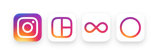
Instagram Redesign.
- Page 1 of 1

Looks like it comes bundled with Mac OS X back in the aughts. Or it's some rando's replacement icons for a free theme you DL for your phone.

It's fine. The bigger issue is that it's not as recognizable/iconic as their original logo, which truly defined an era of those style of logos. The other thing they have to be careful of is that they don't design themselves into a corner with the gradients and color scheme.

By Jay Whatever Go To PostBe hyper critical about Instagram icons, bruhs.Could have done better, the gradient thing just reminds me of when Mac OS X was colorful and even their pinwheel, I don't think that's what they're going for though.

the old icon was iconic but so so so ugly
I think this is good, it still sticks out on your home screen, but I hope other apps don't copy this loud style they will
the app's ui is nice, but nothing drastic there
I think this is good, it still sticks out on your home screen, but I hope other apps don't copy this loud style they will
the app's ui is nice, but nothing drastic there


