
[size=85]slow down yo. pls[/size]

Remember the first time Shannon Brown walked through that door? Its like that - but with that brand new car smell.
I'm happy to announce and bring everyone a preview of what's to come for SLAENT.com. As many of you already know, Sharp and reilo have worked around the clock (speaking in tongues and binary mostly) to provide an experience that is much more versatile and accessible than your typical phBB or Reddit layout. What many do not know is that they've accomplished this from scratch. What you're seeing above is not a photoshop mockup but a reflection of long hours and genuine creativity.
Take a close look at the background image behind the title for each thread at the top. What you're seeing is auto-generated based on the user’s avatar.
Now, look at screenshot #2 for comparison.
This is an actual screenshot of a working site. And just one of many features being built into your browsing experience. There are also a number of other key, streamlined functions that you are familiar with already in place - searches will be extremely efficient, post data will not be lost, threads uncluttered and easy to navigate. These will always be key. Coding from the ground up means that potential for growth is much, much greater than by simply running with a store bought package and calling it day. The plan for SLAENT is to be able to tie in everything that this awesome community produces - podcasts, music productions, reviews, articles, twitch and youtube clips, etc - with a streamlined forum that is user friendly and malleable to whatever direction suits us all best.
So keep providing input. We take everything you have to say about the site seriously. This site will always have its community as its #1 priority so every comment that you send to the development team will absolutely be considered as we go forward. You can look forward to more updates about v1 of SLAENT.com this weekend. Also, please note that the UI and logo are not at all final. Expect more info about both at a later date.
[size=50]#fuckdaknicks[/size]


So keep providing input. We take everything you have to say about the site seriously. This site will always have its community as its #1 priority so every comment that you send to the development team will absolutely be considered as we go forward. You can look forward to more updates about v1 of SLAENT.com this weekend. Also, please note that the UI and logo are not at all final. Expect more info about both at a later date.Two things I would suggest
1) Try to reduce the whitespace
2) Add a dark theme

reilo bro, why are the dates all formal instead of relative? I want to see that someone's post was "today." Why are these hack frauds even working on the new forums when they can't get the basics right?

That is super slick.
Not sure how I feel about names being to the right of avatars instead of above/below but I could get used to it.
Not sure how I feel about names being to the right of avatars instead of above/below but I could get used to it.

Now that I'm fully focused and not tired anymore; great improvement. It looks really good this way, clean and functional. I am still a little concerned about the whitespace around the text in each post -- I feel like it might look glaring if you get a string of single line posts in a row. Might be something worth testing.
Anyway can't wait to get my hands on it.
Anyway can't wait to get my hands on it.

Now that I'm fully focused and not tired anymore; great improvement. It looks really good this way, clean and functional. I am still a little concerned about the whitespace around the text in each post – I feel like it might look glaring if you get a string of single line posts in a row. Might be something worth testing.
Anyway can't wait to get my hands on it.
There's really nothing I can do about that unless I want to do something where the post box only fills the width of the characters, which I don't think would look good.

Oh that whitespace. I thought you were talking about the one to the right of the text, so I was like 'wtf'.
Yeah, I'll play with it. It's all very rough right now.
Yeah, I'll play with it. It's all very rough right now.

You know how realgm has that notifications menu that tells you who quoted you and in what topic? Always thought that was neat./

You know how realgm has that notifications menu that tells you who quoted you and in what topic? Always thought that was neat./A lot of people have been requesting this and I am kind of smug about how easy it is going to be :P

Just got done adding post histories to the UI. Standard caveat: this UI is so nonfinal it's mindblowing. Anyway. Essentially, like any other forum, when you want to rephrase what you wrote...
 ...you go edit it...
 (The editor UI exists, but it looks crappy because it hasn't been styled).
Good, but not very exciting. But what's up with that history button?
 Yep. All your post history is retained, no matter how many times you edit.
Old posts are only visible to you for the moment, and won't show up in full text search (deliberately!), but we have some interesting ideas on stuff we could do with this going forward. At present, consider it yet another layer of security against your posts being deleted. Just wanted to give you guys an example of one of the cool features in the new forums and explain the sort of stuff we're working on, since it's been a couple of days and what I work on tends not to pack much graphical punch.
 ...you go edit it...
 (The editor UI exists, but it looks crappy because it hasn't been styled).
Good, but not very exciting. But what's up with that history button?
 Yep. All your post history is retained, no matter how many times you edit.
Old posts are only visible to you for the moment, and won't show up in full text search (deliberately!), but we have some interesting ideas on stuff we could do with this going forward. At present, consider it yet another layer of security against your posts being deleted. Just wanted to give you guys an example of one of the cool features in the new forums and explain the sort of stuff we're working on, since it's been a couple of days and what I work on tends not to pack much graphical punch.

Messing around with a drastically different layout for a thread. It's quite a departure from what people are used to with forums, but it might be something that people take on because in theory it should make threads easier to read, and could look slick.

Conceptually, what does everyone think of the following? I didn't spend too much time on executing this, but just enough to get the concept across. I specifically want to know if this would be easier for everyone to read in a more traditional newspaper-esque layout, as I am worried that with modern size browsers, traditional full-width layouts are just very difficult to read because the text spans across a very long horizontal distance.

The reason I am worrying about it is this:

Let me know your thoughts.

The reason I am worrying about it is this:

Let me know your thoughts.

Conceptually, what does everyone think of the following? I didn't spend too much time on executing this, but just enough to get the concept across. I specifically want to know if this would be easier for everyone to read in a more traditional newspaper-esque layout, as I am worried that with modern size browsers, traditional full-width layouts are just very difficult to read because the text spans across a very long horizontal distance.
The reason I am worrying about it is this:
Let me know your thoughts.
it's weird, the text span, when you first get a new monitor. But after a while, it just becomes normal.
Honestly, not something that's ever really bothered me.

cool.
with that much real estate being used up, could you use that space to show more information about the thread or specific post?
like show how many times a post was quoted and link you to where the post was quoted?
or if its some kind of news event thread, we can use the left column to show updated news and/or bullet points of events...sort of like a live ticker used in news channels.
whatever response, i like the layout. its fresh, its hip, and best yet, hipsters will dig it!

Looks really good in concept, but I'm not sure how I feel about "Pacers Paul George got catfished... by a man... NSFW" taking up half my screen.
Maybe if there was some functionality in it or you could navigate the forum through the "cover", but then again I'm not sure if that's something I would use and is worth taking up so much of the screen.
Maybe if there was some functionality in it or you could navigate the forum through the "cover", but then again I'm not sure if that's something I would use and is worth taking up so much of the screen.

Getting closer! This is the final UX/UI I am settling on. There's a bit of clean-up to do, but it's nearing completion. Next up is fixing up the header and figuring out the UX for making a reply.
Servers will be up and running in the next couple of days hopefully to be ready for getting the site up in beta. Making a big push this week, stay tuned!


Servers will be up and running in the next couple of days hopefully to be ready for getting the site up in beta. Making a big push this week, stay tuned!


hmmm….Dummy accounts are a real thing! It just happened to have your avatar. COINCIDENCE... I SWEAR... on nothing :twisted:
"dummy"
i'll get you back.
as for the layout, it looks good.

Trying to conceptualize how the menu would function... It would be a small sliver to the right that is in fixed position. Meaning, as you scroll, the menu stays there. The idea is that once I dive into the mobile site, the experience would be nearly identical.


And started progress on what posting would look like. I had these things in mind:
With that in mind, here is the UX concept I am going for:


Much like the menu, the reply form will be fixed to the page, and the thread will be to the left. So you can scroll the page and your reply will be right there in front of you, which allows you to soak in all of the context.
Missing from the reply form are the bbcode buttons and some other clean-up.


And started progress on what posting would look like. I had these things in mind:
- Being able to reply quickly. I am taking the quick reply to the next level and getting rid of the individual thread reply page. There's no need to take the user away from the page.
- Sometimes I get frustrated when replying to threads because I sometimes forget what context I am replying to. Quoting a user helps, but there's posts before and after that shape the discussion. Many times I would open a new tab and go back and forth between the thread and the thread reply page, or I'd use the quick reply but I'd have to scroll back and forth between my post and what I want to reply to.
- The quick reply on most forums lacks features (bbcode) or is too small.
With that in mind, here is the UX concept I am going for:


Much like the menu, the reply form will be fixed to the page, and the thread will be to the left. So you can scroll the page and your reply will be right there in front of you, which allows you to soak in all of the context.
Missing from the reply form are the bbcode buttons and some other clean-up.

That looks amazing.
Just an idea I thought of looking at that: if you could upload a custom cover for each thread, it would be great if you could navigate the board or your subscriptions through the menu bar.
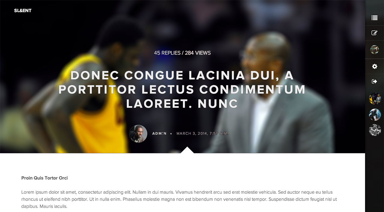
Just an idea I thought of looking at that: if you could upload a custom cover for each thread, it would be great if you could navigate the board or your subscriptions through the menu bar.


Great feedback!
Subscriptions and Messaging will definitely be part of the easy to access menu bar, but that won't be in there until post-launch (not sure when).
Custom covers has definitely crossed my mind and I personally like that idea, but we'd just have to investigate how intensive that will be because hosting custom uploaded images beyond avatars can get extremely expensive and heavy to integrate.


 fucking awesome.


