
db's NBA Design Struggle Thread
- Page 1 of 1
Plenty of people have seen my frustration and general disgust at the "design" put out by the NBA and its teams. Thought there should just be a separate thread for discussion. Plus I need somewhere to vent without derailing the main thread. Anyway, I plan to just post pics either highlighting issues or generally mocking the stuff. All are welcome to contribute.
I give you Washington Wizards Jammies

I give you Washington Wizards Jammies


I like Slaent fine, right now I'd just make the headers smaller.  Oh and I want images not to automatically break to the next line
 Oh and I want images not to automatically break to the next line
By db Go To PostI like Slaent fine, right now I'd just make the headers smaller.Oh and I want images not to automatically break to the next line
Yep that break fucks up so many reaction Smilies.... it sucks

OMG I can't with this, the NBA is a billion dollar industry, the franchises make double digit millions but these websites...here just look at this nav



the new Raptors logo has grown on me.. they probably should have rebranded everything but sticking with the Raptors and doing the new is ok to me

By jWILL253 Go To PostNot even a parody. Still hilarious.?

By jWILL253 Go To Post
Not even a parody. Still hilarious.
By KingGondo Go To Post?because they still look like rec center uniforms

By db Go To PostI just like how terribly they implemented racing squares in that particularly jersey.it's a nod to actual rockets which often have those patterns. but it makes it only slightly less terrible


By reilo Go To PostGondo, you can't defend that. You just can't.I honestly like them. No piping along the stripes/collar gives a nice clean look, orange is a strong uniform color, and I like that we finally have a uniform that says "OKC" instead of fully spelling out "Oklahoma City."
They aren't anything spectacular, but they're solid. The worst thing about them is still the core logo on the shorts.
I'm usually extremely critical of our branding, including our uniforms (the navy alts are ass, the sleeved whites look like pajamas, and even the home/aways are uninspiring and could be a lot better).

By ReRixo Go To Postyou know some shitty designers are making a killing on those nba sites though lolThey're not. It's all a single template developed by NBA Digital in New Jersey.

By reilo Go To Post-________________-This isn't an area I can be accused of being unrealistic in.
I have literally written emails to the Thunder marketing department complaining about the branding of the franchise. I hate most of the stuff they do.
Thankfully the team is awesome so it doesn't matter that much.

cavs...what in the blue hell?
Dan Gilbert
@cavsdan
1 of these 3 will debut tonight at @CavsWGUnited event as a new @Cavs uni. Here's a sneak peek. Which is your fav?

Dan Gilbert
@cavsdan
1 of these 3 will debut tonight at @CavsWGUnited event as a new @Cavs uni. Here's a sneak peek. Which is your fav?


By db Go To PostBurberry ripoff, picnic table or shitty 90s inspired gradients…yup

Still shit.
Crappy retro inspired one with competing hierarchy, v neck sleeved bullshit, and some crap ass patchwork on the side.
Crappy retro inspired one with competing hierarchy, v neck sleeved bullshit, and some crap ass patchwork on the side.
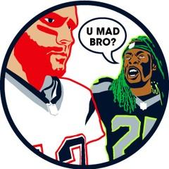
I resurrected this thread to post this concept:
https://www.behance.net/gallery/30682229/Seattle-Sonics-Identity-Concept

My questions to y'all are:
1. Whadayathank?
2. Devo, are you currently grinding your teeth at yet ANOTHER logo design that features a basketball?
https://www.behance.net/gallery/30682229/Seattle-Sonics-Identity-Concept

My questions to y'all are:
1. Whadayathank?
2. Devo, are you currently grinding your teeth at yet ANOTHER logo design that features a basketball?

By blackace Go To Postwhy would you do this?
I've came to terms with my feels a long time ago. It's been almost 6 years, man.
Time to embrace the apathy regarding anything NBA related and quietly hope for a second chance at pro basketball glory.

By jWILL253 Go To PostI've came to terms with my feels a long time ago. It's been almost 6 years, man.Always hoping but jersey designs when there is nothing coming to wear them is painful..
Time to embrace the apathy regarding anything NBA related and quietly hope for a second chance at pro basketball glory.
I like the jet logo tho.. and the home ones look meh.. I like the green border ones than a solid white ones..
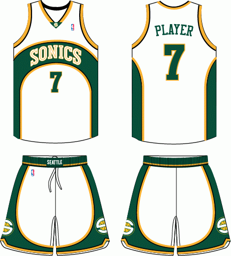


 it hurts so much...

 water melon boyz :'(

